
By Amanda Hofman, Founder of Go To Market
On my recent trip to Sicily, I saw the same tourist merch again and again—pieces that could have been memorable but instead felt tired. When it comes to branded merch, originality matters. Here are three examples that were everywhere… and totally missed the mark.
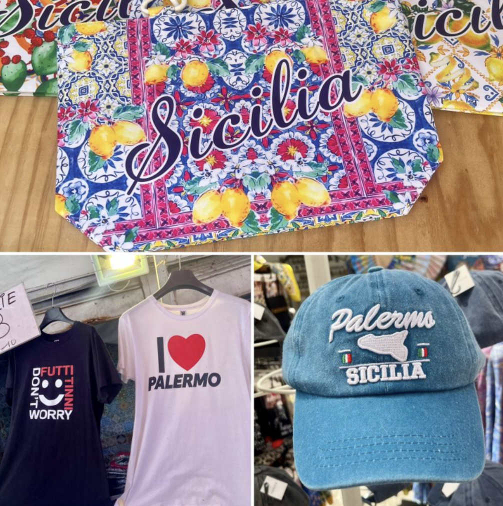
🖤 I ❤️ Palermo
We’ve all seen this one. Swap in any city name and it’s the same T-shirt. Zero originality. Zero vibe. The identical design is printed on shirts worldwide, stripping it of any local flavor. (And don’t get me started on the shirt next to it—the kind of “frustrating merch” that sends you straight to Google just to understand it.)
💙 The Blue Italia Hat
Fine. It’s cute. But it’s in every Italian city, looking exactly like this. When merch is so common it becomes visual white noise, it loses all emotional connection to place.
🌸 The Floral Bag
At first glance—so pretty. Until you realize the same pattern is in every shop. It started to feel like the Big Apple of Sicily: overdone, overstated, and utterly forgettable.
The tourist merch I love is clever, on-trend, and reflects the real vibe of where I’ve been. These pieces didn’t do any of that—and it’s a good reminder for brands: whether you’re creating city souvenirs or corporate swag, the best branded merch tells a story people actually want to carry home.
Your turn, what’s the most overdone, boring visual you’ve seen on tourist merch in your own city?