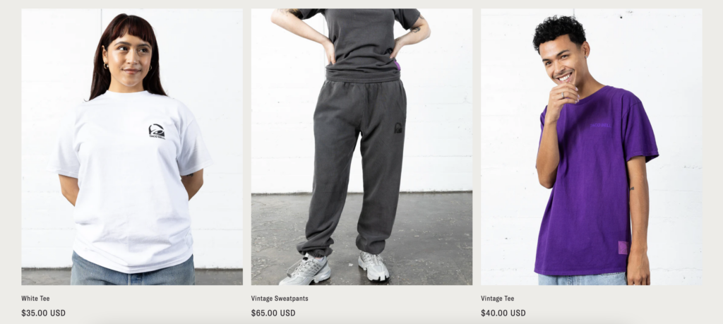
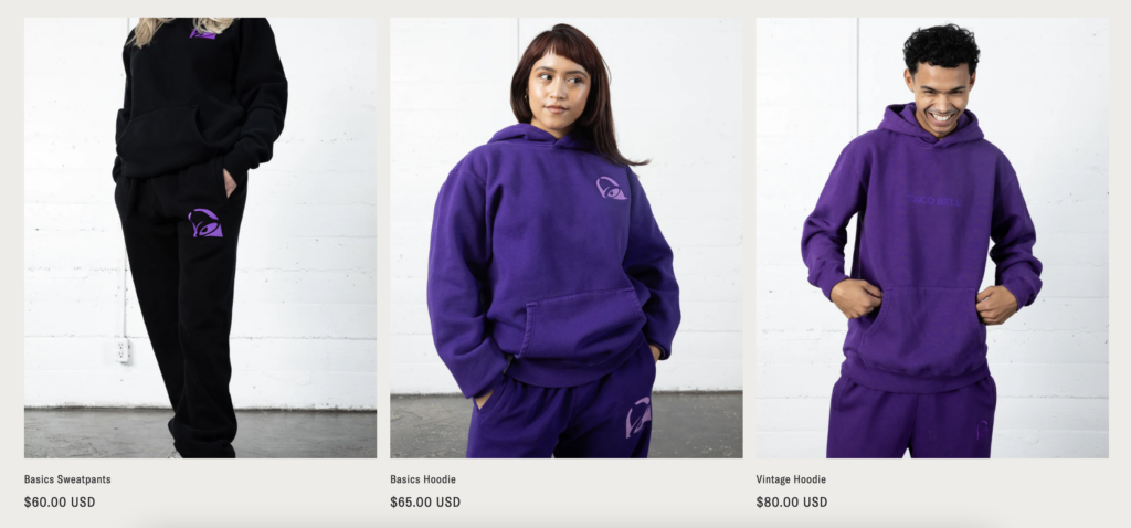
Taco Bell, what the 💩🙅🏻♀️ is going on with your merch?

This store violates everything I know about best practices for branded merch:
👎 The shop is super logo heavy, and their logo is… old and uninteresting
👎 There’s nothing creative, playful or reflective of their brand or brand values
There is one thing they get right, which is their use of current trends:
👍 They are using tone-on-tone (purple-on-purple, gray-on-gray), which is in right now
👍 They’re offering matching sweats sets
👍 Their models are young, diverse and cool
Still, I hate this. They tried to go chic but they’re … Taco Bell. 𝐓𝐡𝐞 𝐦𝐞𝐫𝐜𝐡 𝐝𝐨𝐞𝐬𝐧’𝐭 𝐦𝐚𝐭𝐜𝐡 𝐭𝐡𝐞 𝐛𝐫𝐚𝐧𝐝.
If you’re a fast food chain and you’re making branded merch, taking yourself seriously is a miss. Your merch should be FUN. McDonald’s does this incredibly well, bringing in high end designers to make ironic and playful branded merchandise that’s loud and in your face (on purpose).
Our social media manager disagrees with me on this and likes their merch. What do you think? Do you think their merch matches their brand? I’m not a fan or customer of Taco Bell so I may not be the best person to judge. Who do you think wants to wear this?

